Wednesday, 13 March 2013

OUGD402: Task 8.


Task
Based on the ongoing investigation of your personal and professional identities that have formed the basis of the last three PPPworkshops/tasks, respond to the following questions:
If you were a book what would your subject be and who would read you?

A Rough guide to - A rough guide to is a series of books in which prospective travellers can use to get a 'rough' idea of the place they are travelling to. The rough guide offers advice on aspects of trips from where travellers can stay, activities they can do, places they can visit and restaurants to try. Design for the rough guides is always consistent featuring a selection of typefaces and formats, intertwined with breathtaking photography in which readers can really catch a glimpse of the destination.


If you were a package what would you contain and who would open you?

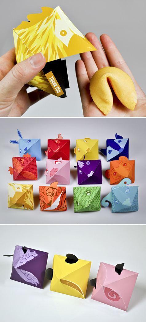
If I were a package I would contain a fortune cookie with a small message aiming to give guidance, bring hope, make someone smile, I could be opened by anyone, those who specifically go out to buy me or those whom I have been given to.
One of my favourite sets of fortune cookie design can be seen on Lovely package.


I love the way in which this product interacts with its packaging, each of the fortune cookies Is based upon animals that represent the birth year a person is born, for example, mine is the monkey. The packaging is innovative, when opened the fortune cookie falls out or can be taken out of its holder with ease, it is clever in the way that the fortune cookie leaves its packaging through the animals mouth.


If you were a shop what would you sell be and who would buy it?Freepeople - A range of clothing/accessories/fashion blog aimed aimed women who are free spirited yet fashion alert and do not mind paying higher prices for higher quality garments. 

If you were a poster what would you promote and to whom?

If I were to be a poster, I would promote a show that showcased creative students work, to potential employers, family and friends of the students and general public. I would like to promote opportunity. 
I found some inspiring poster designs of this purpose on Behance, which were actually posters promoting a summer show at the Bradford school of arts and media, One of the college/universities in my home town.
I like the simplicity of the posters and the use of bright colours together, the posters are also straight to the point and clear.


If you were a brand what would your values be and why would they be important?
I think its always very important to be honest when creating a brand, Do not hide anything, the negative side to any jobs, whether any work may have a sell by date in which they are no longer relevant, to let your client fully understand not only the job, but who you are as a brand. To always stay ethical, to consider the environment and the impact of what we are creating outside our own design studio, are we treating the people in which are helping us to expand our brand with dignity and respect? This is obviously important, as no brand could be successful without the people who have helped build the company, they are the spint of the brand. To ensure that the way in which we create anything is the way in which is most healthy for our environment. For example If you are wanting to create some kind of advertising via helium ballons, is this appropriate? Once helium is used it is wasted and cannot be replaced, one day it may be found that this is an important source in the future. To create design that doesn't cost the earth. On a more social aspect I would encourage the idea of promoting positive changes, and not push those who need to make the change or whom I am needing to persuade to do something through scrutiny, criticising and segregation. 

For example: The body shop are a brand who take their values very strongly. they are both considerate about Ethics of animals and the people whom work for them. 


The body shop since 1993 have spent much time and effort working on a pledge to bring an end to cosmetic testing in the animal world, which finally made headway on the 11th of march this year, in which Animal tested products were banned from being sold in the EU. 


They continue to fight this battle so that the banning of animal tested cosmetics becomes an international success.


The Body shop also express that human rights are a passion of theirs, and that making sure the people whom work for the brand are treated with the respect that they deserve. 


If you were an exhibition what would you show and where would you show it?
If I were to be an exhibition I would be an installation exhibition, as I am very interested with art on a larger scale and that can be interacted with. Exhibitions do not always have to be exhibiting art and design, Below is a great exhibition I found on light that is currently showing at the Hayward gallery. 

http://www.youtube.com/watch?feature=player_embedded&v=rY5BHWYlDIo

An exhibition I also like is the Rain room installation set up at Londons Barbican:
Visitors are invited to walk through a room of falling water, however they are not affected by the rain due to sensors being able to detect where visitors are.


If you were a leaflet what information would you contain and who would read it?
If I were to be a leaflet I would want to be one that promotes awareness of a problem of a certain cause, I wouldn't want their to be an age restriction or gender restriction of who It is aimed at as when promoting problems it is important to target as many people as possible.
i found a really great set of leaflets promoting/ making people aware of the existence of the decline in existence of some animals. The leaflets are sent out to previous members who are already signed up to the Malaysian nature society, when they renew for another year, for every year that they renew they are sent a new leaflet, which they are then able to construct. 


If you were a sign what would you show, to whom and where?
If I were a sign, I would be a way finding system, I find not only I am concerned about my own success, but I also find happiness in helping others and feel successful in doing this. Hence as a way finding system I would be helping others find their way around any area, a park, a shopping centre or a city, to reach their destination in which they have desired to go, and if they manage to reach this point with my help, then I have been successful in helping others. 
One of my favourite way finding systems I have seen I found on Behance.


This is a way finding system designed by Grazielle Bruscato and Eric Pautz, for the 'Parque Moinhos de Vento' in Brazil, One of Port Alegre's most popular parks. The designers have designed the symbols used for each sign by drawing up and triangle grid, and blacking out sections to make certain shapes for example, a dog, a child, a bike. The symbols are both clear and helpful and provide an easy way, using the map above to navigate around the park. I also think it is successful in the way the signs have been projected, It can often be difficult designing for locations such as a park which are very much natural and organic, however this way finding system seems to blend in with its surroundings with the same ease in which it navigates its passers by. 

If you were an App what would you do and who would use you?
If i were to be an app I would be a video communications app like the the Skype app, Anyone around the world can use these type of apps, as this is what is so great about these types of apps. The app allows for a new dimension of communication, where people are able to talk over the phone, via tablet or laptop as if they were in the same room, enabling a more pure type of communication. 


If you were a blog, what would you be about and who would follow you?

If I were a blog, I would like to be a design blog that inspires prospective graphic designers like myself. Giving advice on how to succeed in industry, how to stay motivated, posting clever and interesting graphics and interviews fuelled by questions which my readers would like some help with or to know the answer to.
Taking inspiration from such design sites as the Dieline, Designspiration and Just Creative.


If you were an event, what would it be and how would you promote it?
If i were to be an event, I would choose to be a street festival abroad, I love to be immersed in other colours and traditions, and enjoy other aspects such as the food, people, and the array of colour which you are welcomed into. This could be promoted via website, promoting the event internationally for those who want to visit over seas, via mass produced flyers put up in the surrounding city, and exposer on networking sites such as twitter etc.

Below is an Image i found of the San Fermin festival, In this festival which last for a week, bulls are let off at 8am, A group of the cities bravest men run ahead pf the angry bulls.


Each of your responses should be supported by appropriate contextual references and visual material demonstrting your growing awareness of the design industries. 

OUGD402: PPP Session what makes me?

After choosing the 10 Images that apply to ourselves - 5 things about ourselves outside Graphic design and 5 things that represent things we like within graphic Design.

We got into our group of 6 which we were in for the Communication is a virus brief and split into three pairs. In these pairs we swapped our images with each other. 


Me and Sam Horbury had to Analyse Daisy's and Melissa's images and analyse 5 things these said about their personalities and 5 things about their practice, making these findings into a 50 word statement. 

Daisy

Daisy likes to Ski as a hobby and maybe she has been on a skiing holiday or is planning to go. She gets distracted from work by watching you tube videos or visiting other sites on the internet. She likes dogs or has got a dog. We also thought that Daisy is organised, or may aspire to be more organised and likes to keep fit in classes such as zumba. 
As far as practice is concerned. Daisy is very interested in packaging design, particularly those or design in general that is minimalist but has a funny tone of voice. She also likes it when these values are combined with clever concepts. Daisy keeps up to date with looking at blogs, or thinks she should view more as this is an important part of development.

Melissa

Melissa likes to take care of her hair or in particular the way in which she presents herself to others, as well as taking pride in her appearence. Melissa likes to go out and have fun, she does this by going to gigs because she loves to listen to music. She likes New York, and has been or would love to go in the future.
Melissa is organised or alike to Daisy would prefer to be more organised. Her favourite type of design or design she enjoys doing most is Editorial with mostly fashion based content. She is interested in both physical and digital collage and combining media as well as installation design with a fine art edge.

We then reconviened in our group of 6 to hear what other people had concluded about us by viewing the 10 images we had chosen.

From meeting back up we realised that in our pairs when assessing each others images we made a few to many mistakes about the personality and practice of people in our groups. We thought that som of the images that were supposed to represent the persons practice represented their personality etc and it wasn't always clear which was which.
For example the pair that assessed my images assumed that I liked everything I put forward, and began to link images together and gain dual meanings, however each of the images were supposed to be reviewed seperately.
For example I had a picture of a beach (specifically Laguna beach in california) and a front cover of a cd.


Looking at the beach and seeing the Words Mediterranea the pair thought that I liked to travel to the mediterranean.
From this I learnt that we need to represent ourselves more literally, for example, I should have chosen an image with a sign that said laguna beach on, and an album cover that says chill out on to represent my love of chill wave music. 


Sunday, 3 March 2013

OUGD402: Study task.

5 statements that clearly state me as an individual which are not to do with design or creative practice. To be backed up by image.

Travel.
One of the things that makes me happiest is thinking about the places I have been and the places I will go. I have been lucky enough to have travelled to an array of places across the globe, my favourite destinations being; California, New york, Barcelona and Paris. I love being exposed to other cultures and ways of life that are different to my own. I believe that these experiences have made me a more considerate and well rounded person, and it is these moments throughout the years that I look forward to most.


Performance Arts.
Not only do I enjoy going to watch performances, plays, musicals, dance shows I also enjoyed taking part in these classes for 12 years. From these classes I was given a lot of opportunities which I enjoyed very much, including travelling to London, Paris and Barcelona for performances and taking part in extras work on the Waterloo road set. 


Driving
The more I have grown up, the more I have strived for independence. One of my greatest achievements was passing my driving test. Being able to drive myself instead of having to ask others or get the bus gave me greater freedom and independence. Passing my driving test has also instilled me with the confidence that If I work hard I can achieve any goal. 


Joker.
I have always been the type of person that likes to make people laugh, and to laugh in return. I find that laughter is the cure to many situations and that I try to break down many barriers by making people laugh. 


Music.
The music I listen to almost 100% of the time is dependant on my mood and how I am feeling. However I have grown to like one particular genre of music more recently, electronic and chillwave music helps me to be more productive and provides relaxation. 


5 statements that state me as an individual in terms of Where I am at and what I want to do, supported by evidence of graphic design.

Whilst I have been at university I have soaked up information like a sponge and learnt a lot about myself as a designer and the type of design I like, I was recently recommended to look at Kate Forrester's work and after seeing the type of pieces she has created and the way in which she commits to each piece and every detail was inspiring, I would love to be able to produce work like hers one day.

Kate Forrester
Cover design for book, The Emperor of Paris.
http://www.kateforrester.co.uk/books/book-5/

Looking at other designers work, and that created by my peers, I would like to look into working with paper more, in particular paper craft. Utilising skills such as paper cutting and origami to experiment and create unique pieces. I would also like to consider working with 3d graphic design instead of 3d using paper craft.


Jonathan Shackleton 
Oragami suits for Fedrigoni paper.
A set of oragami suits that showcase the 262 choices of paper in use together. clients are sent the paper and instructions of how to make the suits, in which they can construct themselves, giving them the understanding of the paper and what colours/textures etc work well together.
http://www.artrick-playground.com/article/Jonathan-Shackleton-for-Fedrigoni-Paper-a-Origami-Suits/1926/1210262

There Is one skill that I have been keen to learn ever since starting graphic design at LCA and that is embossing and letterpress. Work produced via these processes has always been among my favourite, and I am glad that LCA have organised Letterpress workshops in which I will be able to eventually posses the skill to use these processes.


Embossed bite business cards for a dental care surgery.
http://www.andrewkeir.com/7-clever-die-cuts-embossing/


Now that I am more comfortable with using digital programs such as illustrator, indesign and photoshop, I would like to go back and learn more about what I can achieve through hand crafting design. More so I would like to work with watercolour experimentation, and trying to use screen print as a process option, as I have not utilised this area of the college yet.


Karen Kurycki
Poster design
http://www.behance.net/gallery/AIGA-Design-Connection-poster/146519


I want to become more knowledgeable, to always approach design with an open mind and to learn whatever is possible about Graphic design. I want to develop a more directional approach to the type of work I would like to pursue and the workplace. I want to work within a design studio as oppose to freelance as I enjoy the setting at LCA where I am able to ask other graphic designers for opinions/feedback.


Vibe studio manchester.
Branding for around the world, tea/coffee company.
http://vibestudio.co.uk/portfolio/around-the-world
I really enjoy the process in which this studio works from when they meet the client to the final product.
http://vibestudio.co.uk/about

OUGD402: Studio session.

In the studio session we revealed to our groups (those who we had made ads for) our designs. 

We had to analyse how our group had been successful in designing ads for us and how they had been unsuccessful. We also had to rate our own work.

Sarah's ad design for me:


Good:
- Moderate use of colour. 
- Lots of white used.
- Customized typography.
- Colours that have been chosen (shades of orange are my favourite)
- Use of line looks like projects I have produced.

However I thought the design was slightly too geometric, something more fluid/ organic would have been more fitting.


Good:
Evidence of mixed media which I like.
Use of Watercolour image.
- Organic forms.
- Fluidity
-Illustrative.

Bad: 
Still encorporates geometric shapes.
Too much black?
Needs to be more fluid - less chunky black lines.
Square format - Would prefer a longer format.


Good:
Fluidity of patterns.
Use of circles and line.
Influenced by the organic.
Illustrative patterns.
Use of brushes to create patterns.

Things that I would change are the colour combination, the amount of white space and the typeface used, I feel it is too simplistic for me.
We then moved around the room and sat down with a different groups work, were we analysed 5 things that the free ads communicated as a set for each person.
-Will
Similar:
Illustrative.
Hand rendered.
Fun.
contemporary.
Individual.

Things that didn't quite combine for wills pieces were:
The colour scheme, two of the designs used strong colours, whilst one used neutrals such as pale blue and brown.
2 of the posters had a very energetic/busy format whilst one was very minimalist. 

I'm not sure whether these differences were due to miscommunication, or that one person did not really try to get to know Will and his design practice and designed more towards what they liked.
-Amy
Similar:
Editorial.
Modernist.
Contemporary.
Feminine.
Classic.
Stylish.

Differences:
Colour scheme.
Use of photography in one and not others.
Layout.
Shape of piece.

The differences in the pieces created for Amy were not overpowering, they were only slight differences and the others in her group seemed to represent her well. 

- Jane
Similar:
Emphasis on culture/hometown.
Formal language.
Serious tone of voice.
Use of colour.
All digital.

Differences:
One of the only differences we found in the pieces created for Jane were the ratio of colour used to white space. In some their was lots of white space in comparison to others where there was hardly any. 

We then Returned to our own groups work, and read about the similarities in which we were trying to communicate about ourselves and what had been percieved when people were looking at the free ads designed for me.

Similarities:
From looking at the ads designed for me people understood that I liked the use of textures, different textures and fluidity.
Both Ads also gave the same information on what I would specialise in with Graphic design.

Differences:

People thought I was very colourful however I choose to op for minimal colour - few colours if possible when designing.
That I like geometrics and shapes, however I prefer to leave these out of my designs and go for a more organic look.
People thought That I could be a very precise designer, however I am more free spirited and up for experimentation. 

As the last part of the studio session we looked at the pro's and cons when personality is reflected in practice.

Pros:
- Clients gain an understanding of who you are away from the job.
- Our designs are reflective of working with a certain audience eg. likes to work with projects with a feminine semantic focus.
- Humanizes your work and the relationship between designer and client.
- Demonstartes your workability, your skill set may be great however, will people be comfortable working with you? are you easy to work with?

Cons:
- You might not be suited to the client.
- If they want someone serious and your are light hearted it may put them off.
- Your signature style may not work in your favour and instead throw you into a designer rut. 
- If you communicate your personality, and someone does not like your work some may take it as a personal blow/attack.
- People are not picking your work for your personality.